The Ark is delighted to have worked with the renowned charity Martin House Children’s Hospice, evolving their visual identity into a more modern and mature look and feel and one more befitting the digital age in which we live.
The Ark is delighted to have worked with the renowned charity Martin House Children’s Hospice, evolving their visual identity into a more modern and mature look and feel and one more befitting the digital age in which we live.
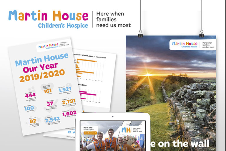
We have redrawn the logo while still keeping the child-friendly, bright and colourful qualities of the original. The colour palette has been reduced and is now more focused and the new strapline – Here when families need us most - has an emotive appeal that encompasses the full scope of the Martin House offering.
To build a consistent presence and gain better recall we have designed templates for all key pieces of communication.